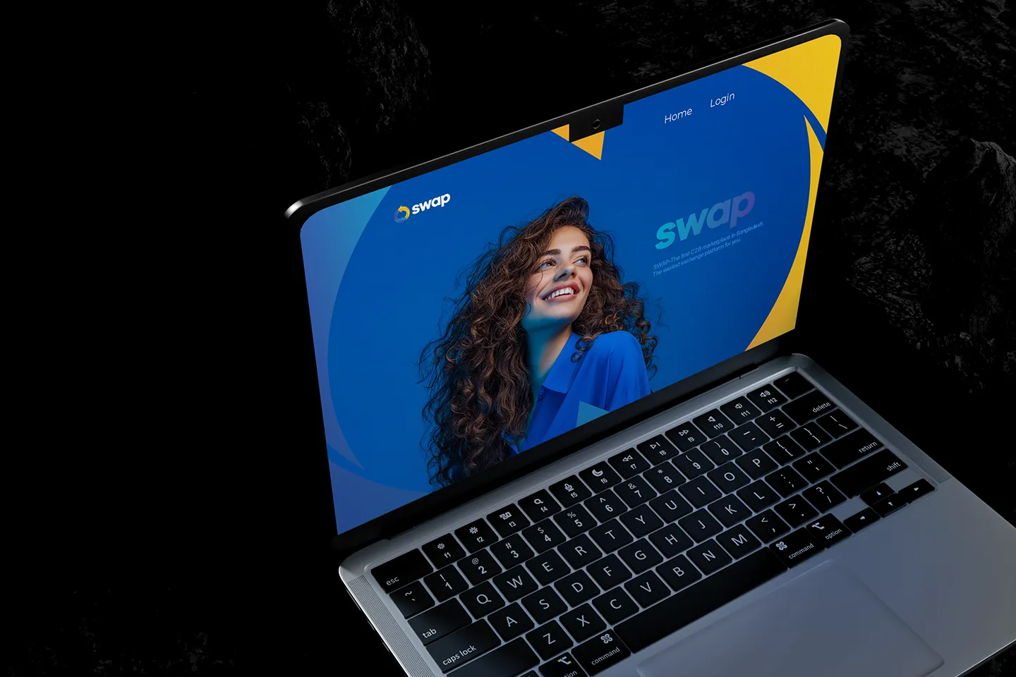
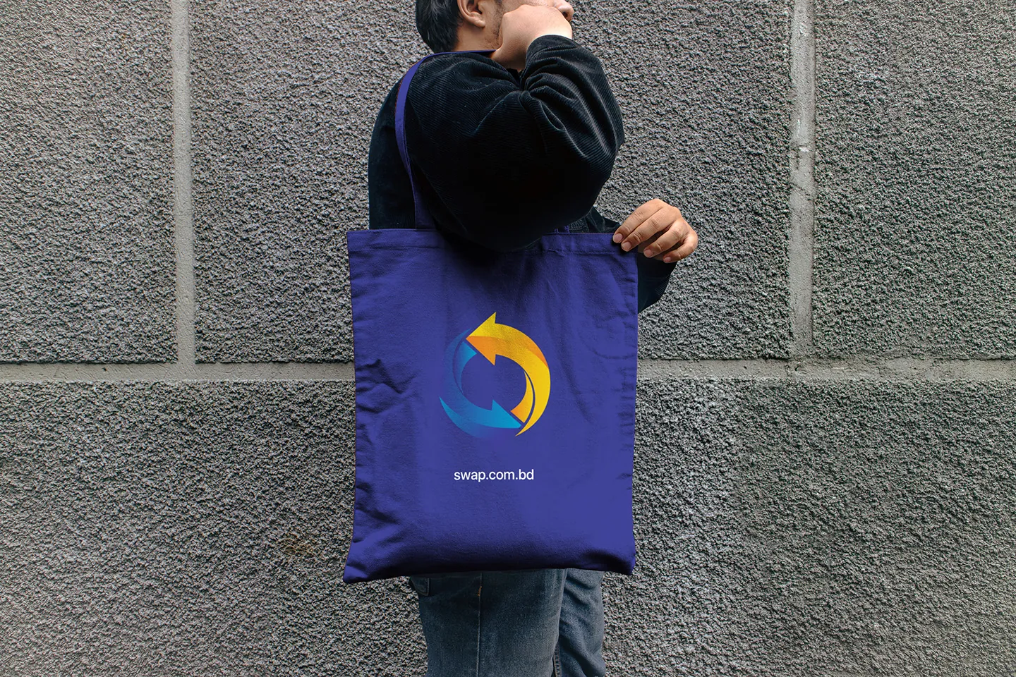
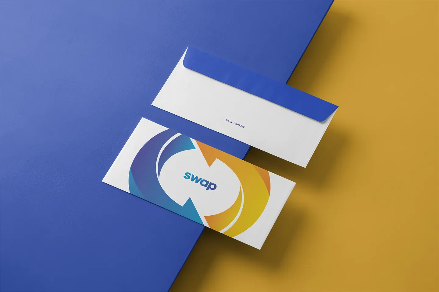
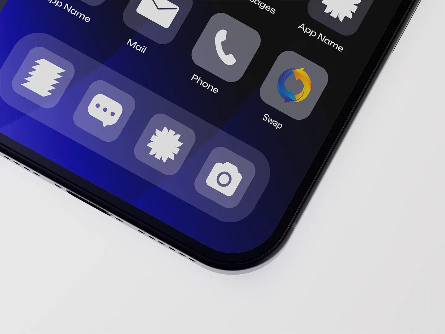
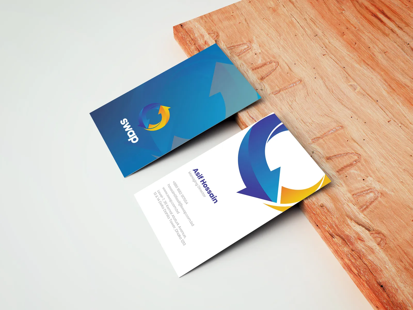
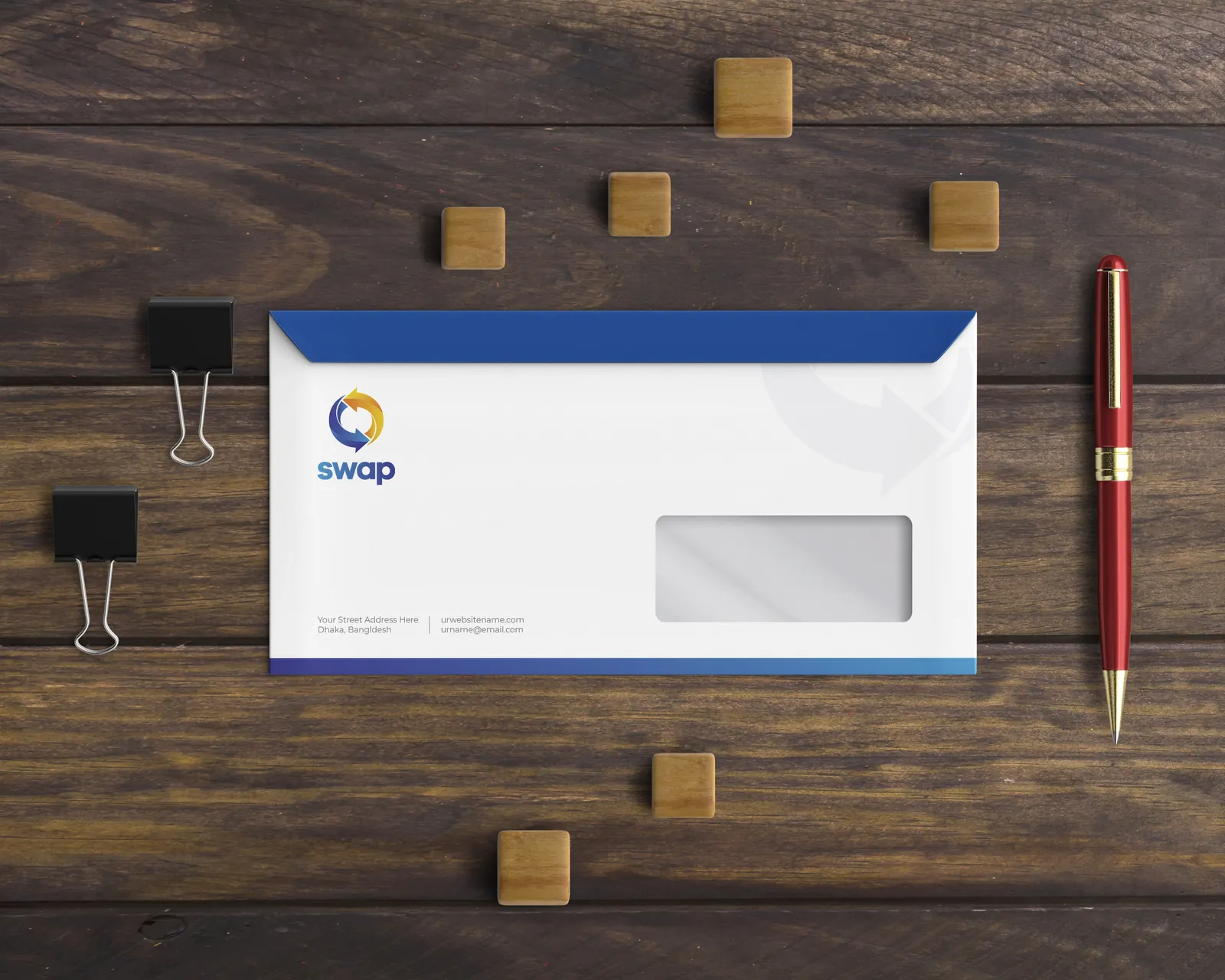
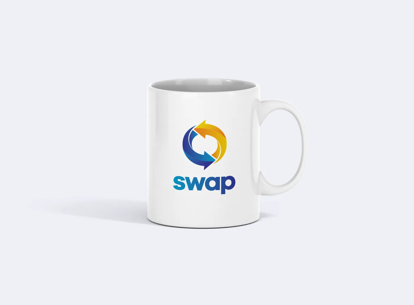
Selling a used phone in Bangladesh used to mean haggling with strangers online. Swap changed the deal: it buys used phones, laptops and gadgets directly, checks them, and passes each one on to a new owner. It was founded by Parvez Hossain, who earlier built the Livewire gadget-store chain. The identity was designed in 2019, ahead of Swap’s launch in 2020.
2020
Founded
Launched in Dhaka during the pandemic, a year after the identity was drawn.
C2B
Model
Swap buys your item itself. No haggling, no strangers.
Selling something you’ve owned is personal. The brand had to feel safe enough to hand your phone to, and quick enough to feel like a trade, not a chore.
The seller
“I don’t want to haggle with strangers.”
A fair price, fast
No meet-ups, no risk
Picked up from the door
The buyer
“I want a used phone I can trust.”
Checked before it’s sold
A real company behind it
A price that makes sense
Swap sits in the middle, so the identity had to speak to both sides at once.
03The rounds
three rounds before the deal.
Every trade starts with offers. This one went through three rounds before the final mark was agreed.
Round 01
First offers
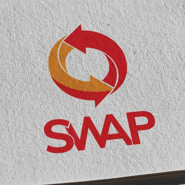
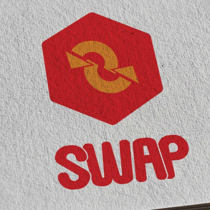
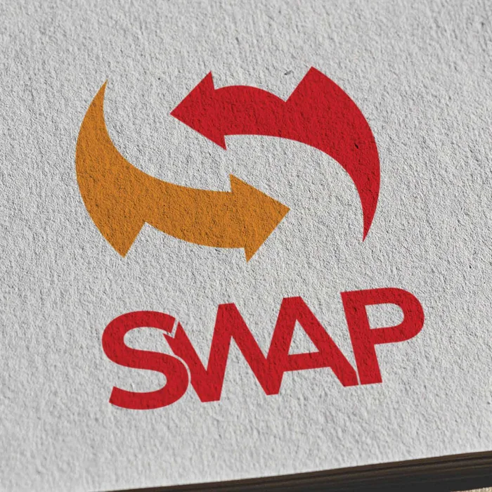
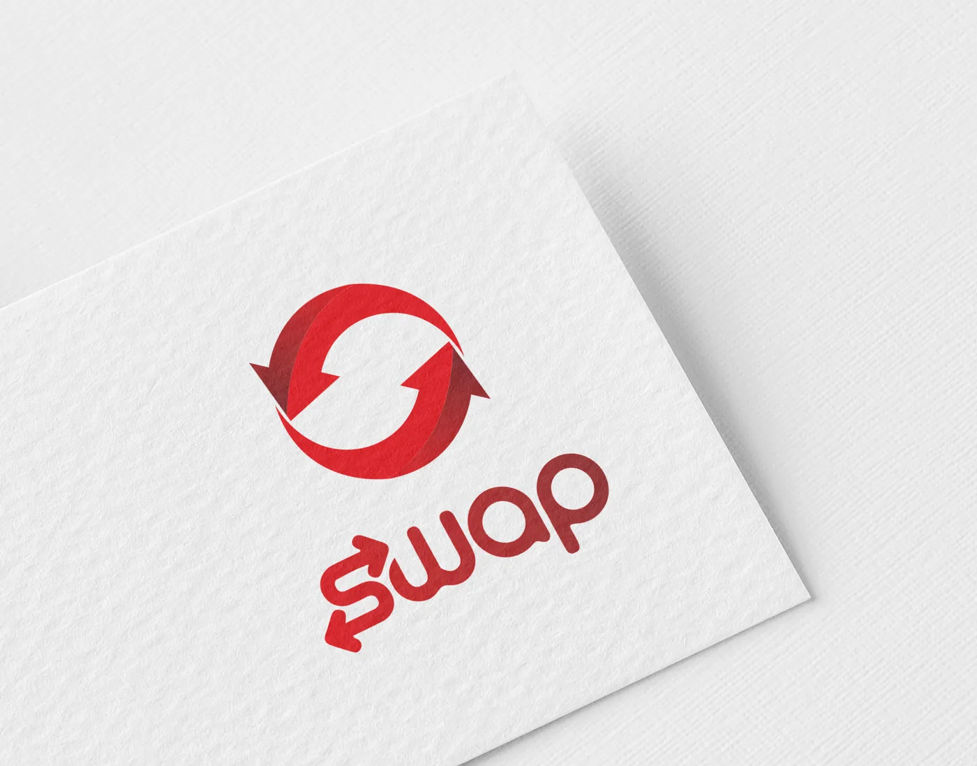
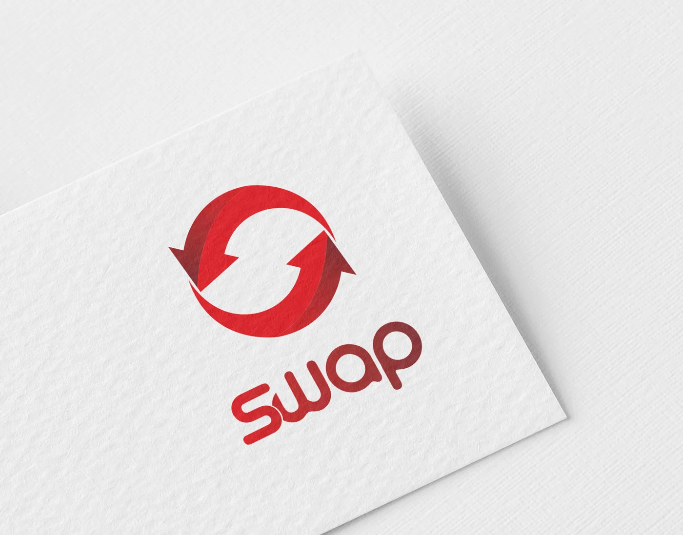
Three directions in red: a loop, a hexagon and a double S. The loop won.
The loopThe hexagonThe double S
Round 02
Counter-offers
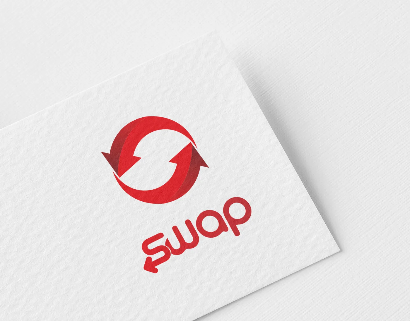
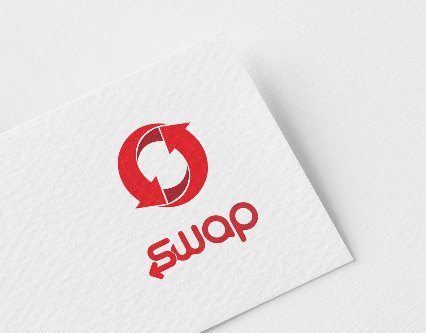
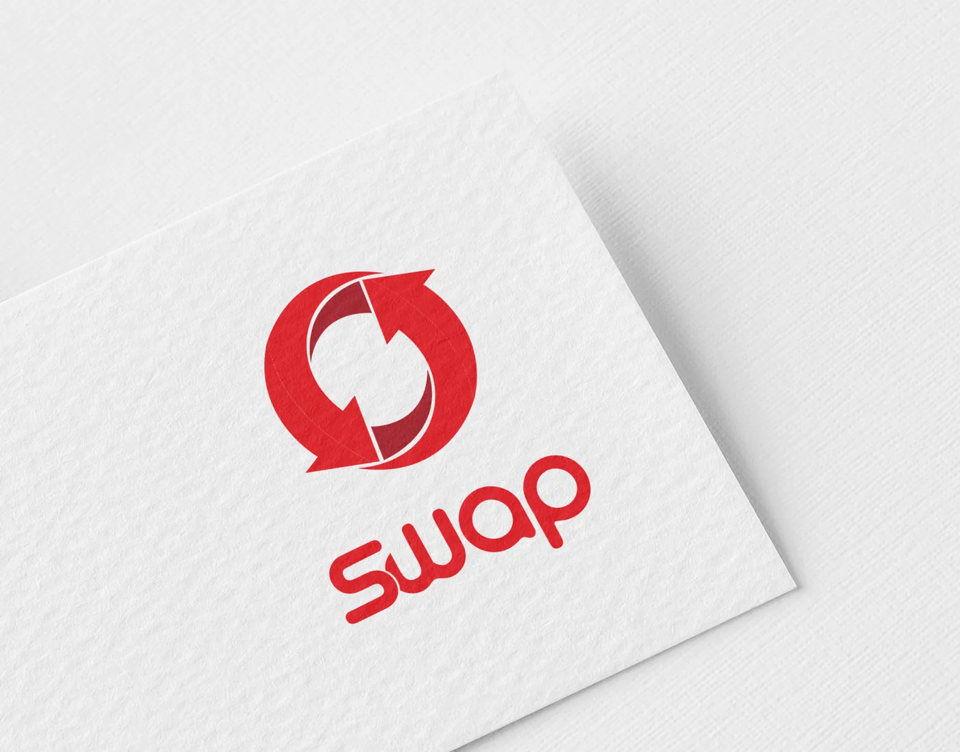
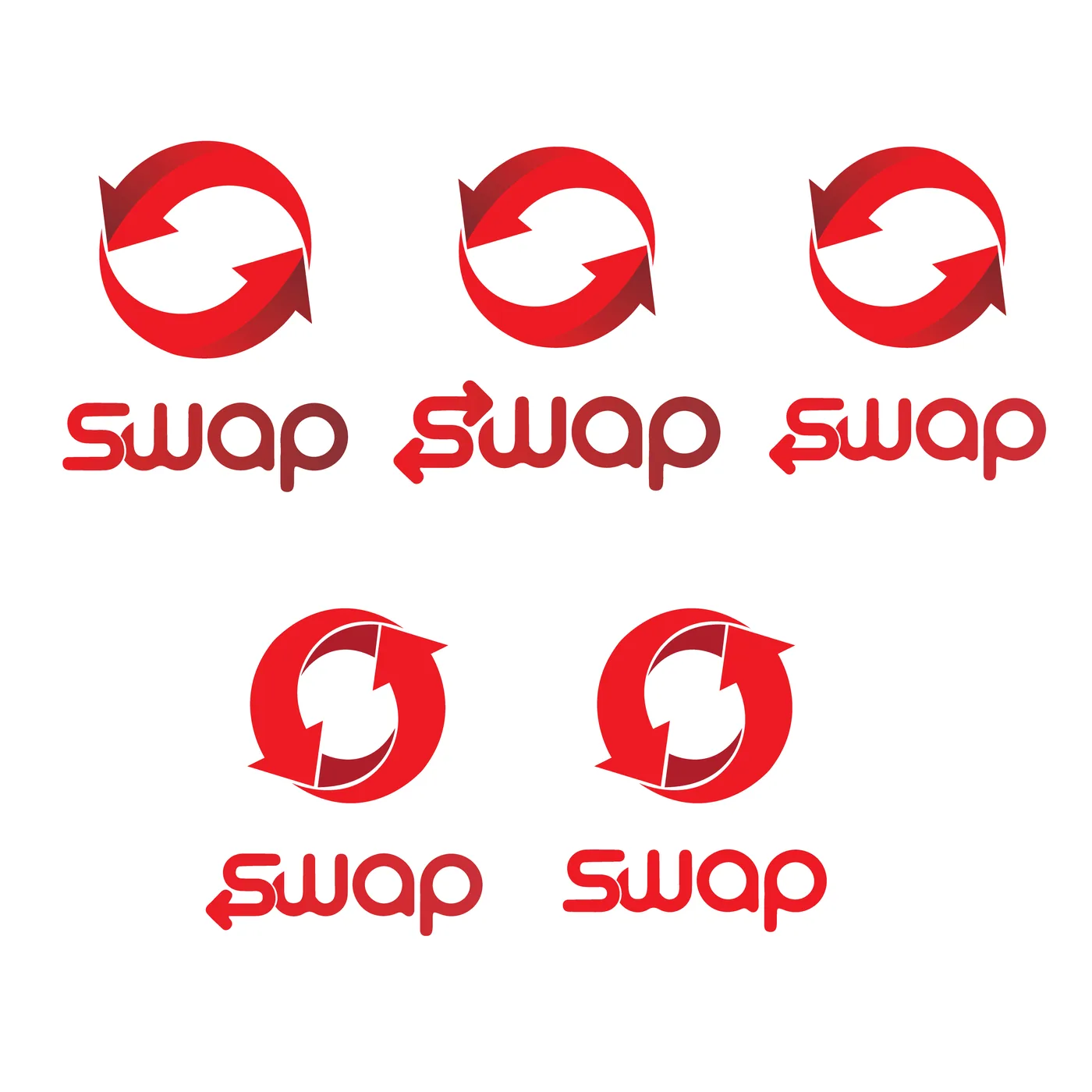
The loop was redrawn seven times: the arrowheads, the gap, the weight of the ring.
Round 03
Never listed
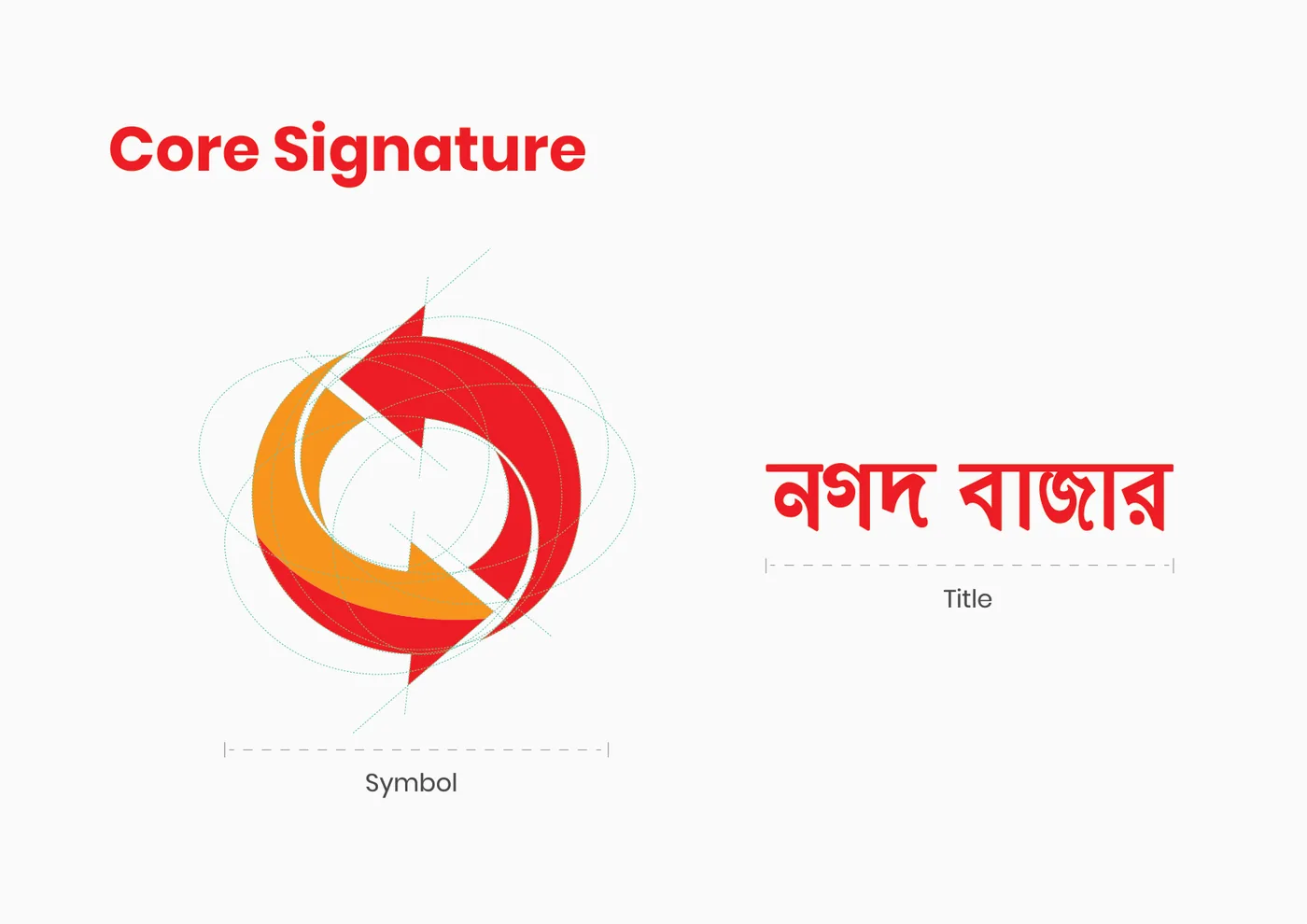
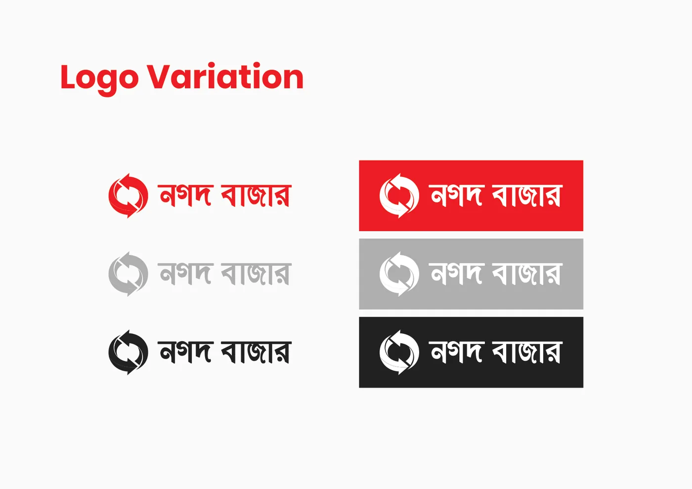
The same mark was also built out as Nagad Bazaar, a complete bilingual identity with its own guideline. The project moved forward as Swap alone.
Not listed
04The swap
Then the colours traded places.
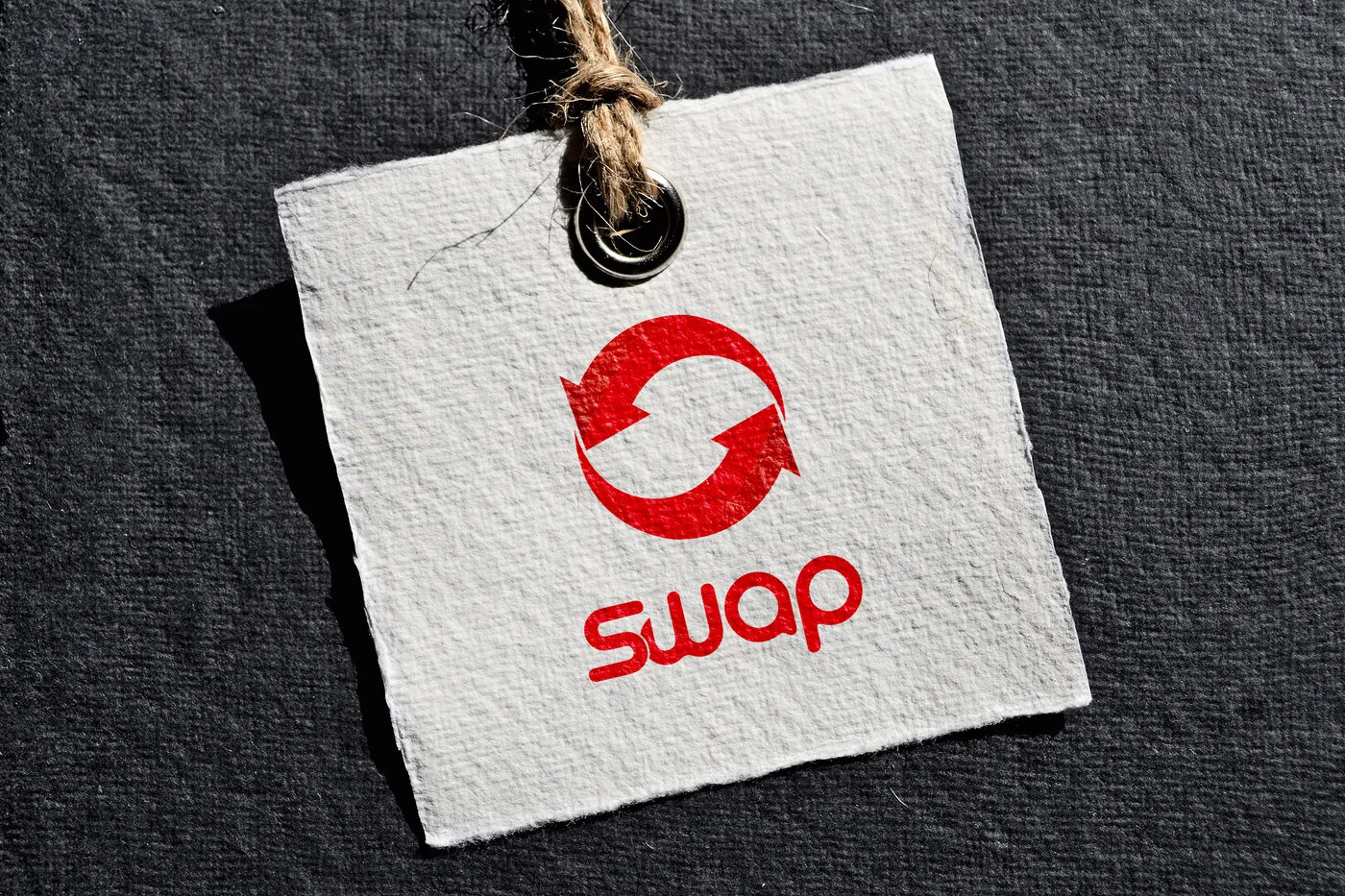
Born in red and orange, the brand needed to stand on its own. So the colours were swapped: indigo for trust, yellow for the moment of the deal. Drag to see it.
Final
Draft
05The mark
Two arrows, one circle.
Each arrow is the other’s reason to move. The symbol is built on a set of overlapping circles, so the two halves always meet at the same angle.
Blue is what you hand over.
Yellow is what comes back.
06Terms & conditions
The rules of the deal.
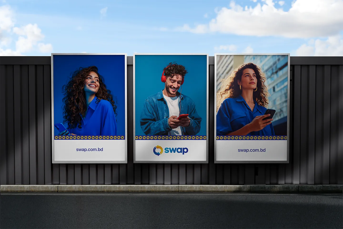
Four rules keep the logo the same wherever it appears, from an app icon to a billboard.
Swap · Terms & conditionsBrand guideline, 2019
XXXX
XXXX
A fixed margin, X, protects the logo on every side. Nothing (text, edges, other logos) comes inside it.
300 pxDigital & on-screen80 pxIcon with name60 pxSymbol only
Below these widths the arrows close up and the gap between them disappears.
Full colour
Reversed
Black
Grey
Full colour comes first. One-colour versions are for single-ink printing and engraving.
Tap any of them to swap it back to the right version.
07Two sides
Cool for trust, warm for the deal.
Two gradients, one for each arrow. They always appear together, the way the two halves of a trade do. Tap a colour to copy it.
Trust
Deal
08Voice
Round and plain-spoken.
Montserrat carries the headlines: geometric and round, like the ring of the mark. Hind carries everything people actually read: prices, terms, the small print of a fair deal.



 Draft