Brand Identity · 2026
Origene Brand Identity
A trust-first identity for Bangladesh’s farm-to-table supply chain
- Client
- Origene by MalikA Malik Seeds brand
- Brand Designer
- Asif Hossain
- Year
- 2026
- Status
- Launched
01 Seed
Bangladesh doesn’t lack vegetables. It lacks proof.
Since 1969, Malik Seeds has put the right seed in the farmer’s hand. But its role ended once the seed was in the ground. What happened between the field and the family’s plate was out of sight — and that is exactly where trust breaks.
20–40%
of vegetables are lost before they reach a buyer
Iram Malik, Director · LinkedIn
$1.5B
lost along the chain every year
Iram Malik, Director · LinkedIn
85–90%
of vegetables move through traders with no traceable source
Iram Malik, Director · LinkedIn
30–50%
of vegetables tested in Dhaka markets carry excess pesticide residue
Origene by Malik · malikseeds.com
So Malik Seeds set out to own the journey all the way to the plate. The brand’s job was simple to say and hard to do: make “safe food” believable.
02 Root
A vertically integrated farm-to-table ecosystem.
Origene bridges the gap between disciplined cooperative farmers and safety-conscious urban consumers through a rigorous, data-backed supply chain anchored in global safety standards and laboratory verification. It doesn’t broker third-party commodities — it controls the crop cycle from seed to shelf.
Mission
Build a transparent supply chain integrating thousands of farming families to deliver certified safe foods to health-conscious urban consumers.
Vision
The most trusted name in Bangladesh’s farm-to-table supply chain — the brand that made safe food mean something.
- 1Sourced from certified farmers
- 2Batched & traced at collection
- 3Processed & lab-tested
- 4Delivered under full cold chain
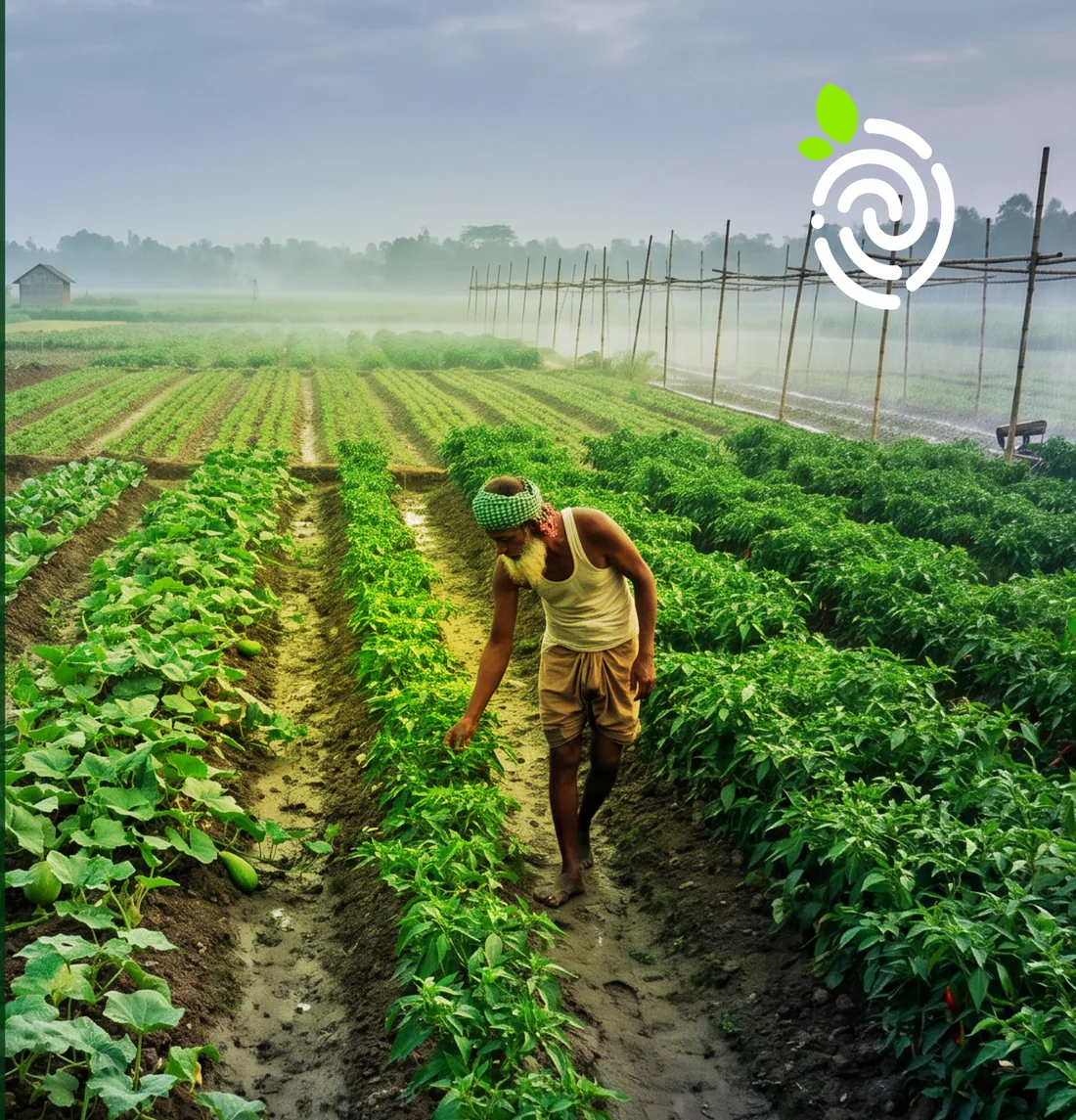
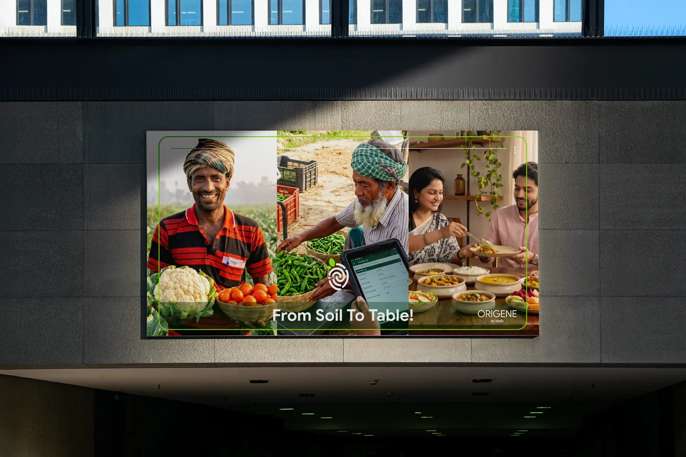
From Soil to Table!
03 Sprout
Three rounds to one mark.
The brand began life as Planted by Malik Seeds. Over three client presentations, the name and the mark were tested, narrowed and rebuilt — until an idea from the very first round came back as the answer.
-
Three directions, three different bets on what the brand should lead with.
 Explored
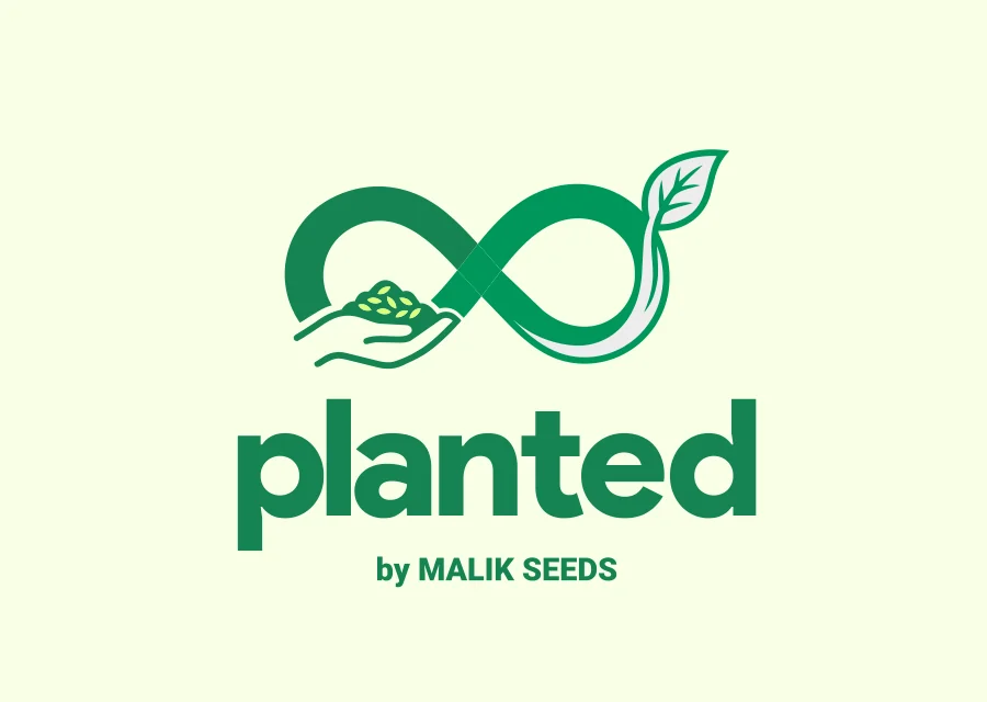
The Unbroken PromiseAn infinity loop for an unbroken supply chain, cradled by a farmer’s hand. 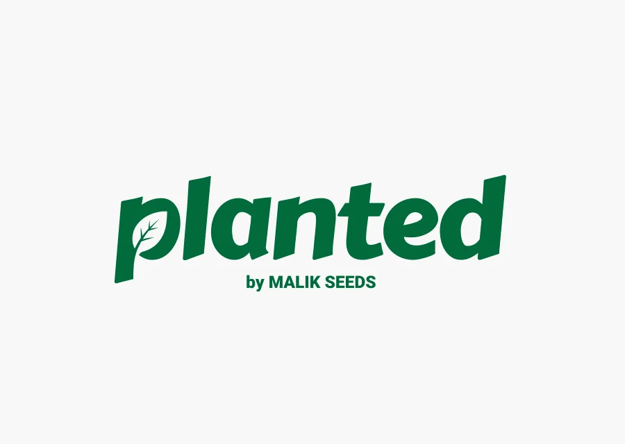 Explored
Nature at the CoreA pure logotype, built to stay legible on phones and fast-moving packaging. 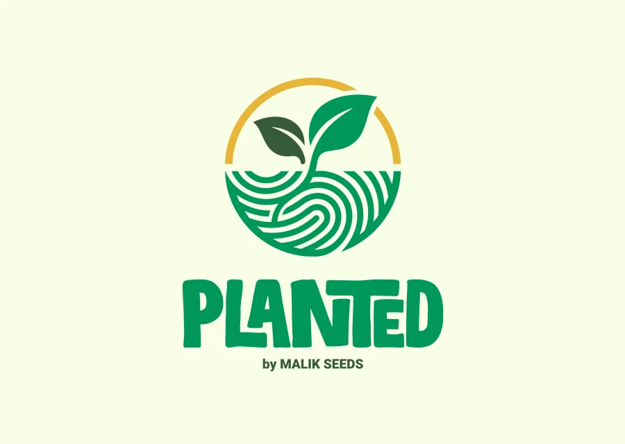 Explored
The Mark of OriginA seal of authenticity. Its brief: “unique source, like the fingerprint of farmers.” -
Narrowed to one theme — the journey from farmer to family table — told three ways.
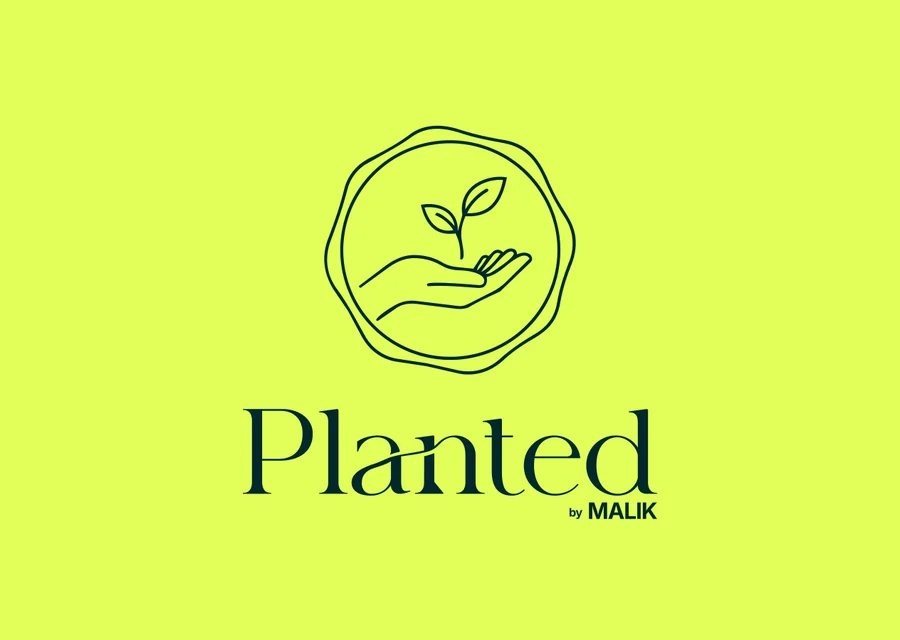 Explored
The SealA sprout held in an open hand, stamped like a mark of approval. 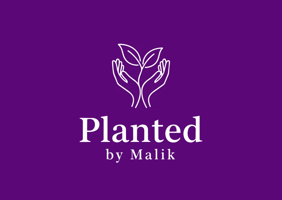 Explored
Cradling HandsTwo hands growing into leaves: care passed from grower to buyer. 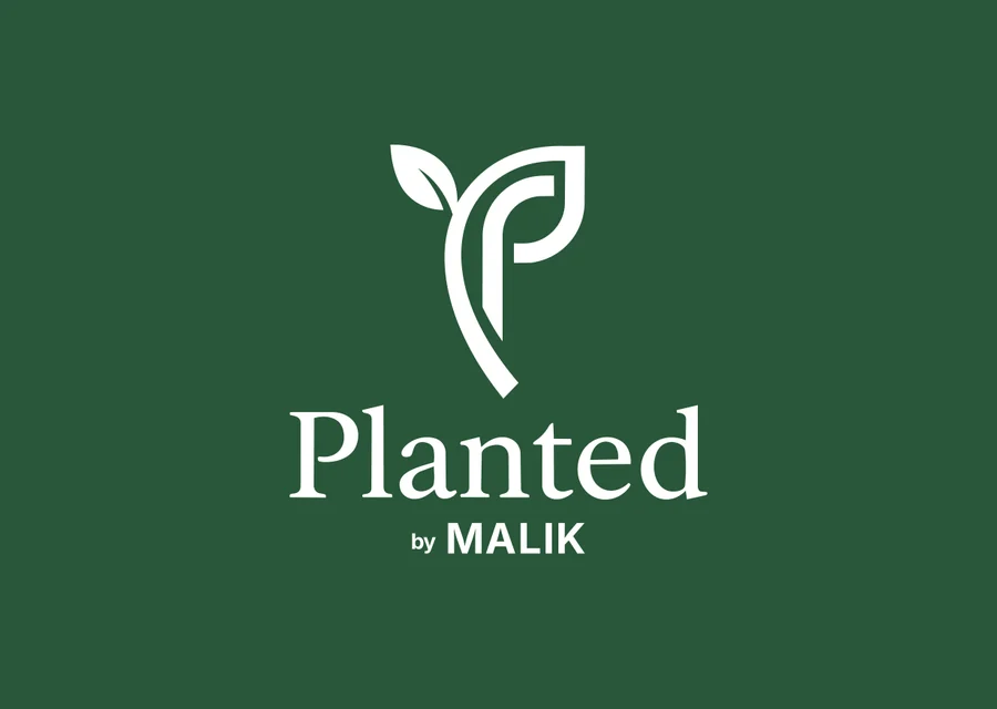 Explored
The Sprout PThe sprout abstracted into a geometric “P” lettermark. -
A new name rooted in origin, and a hand holding a heart-shaped sprout, pushed across nine lockups, a brand story and packaging tests.
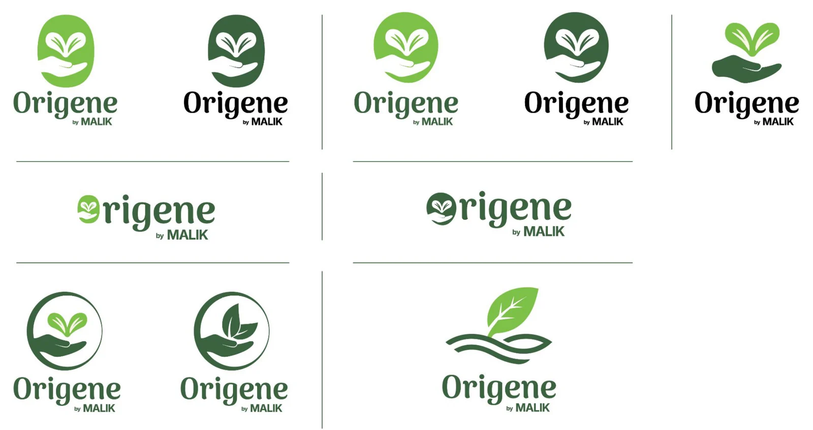 Explored
-
Chosen ✓
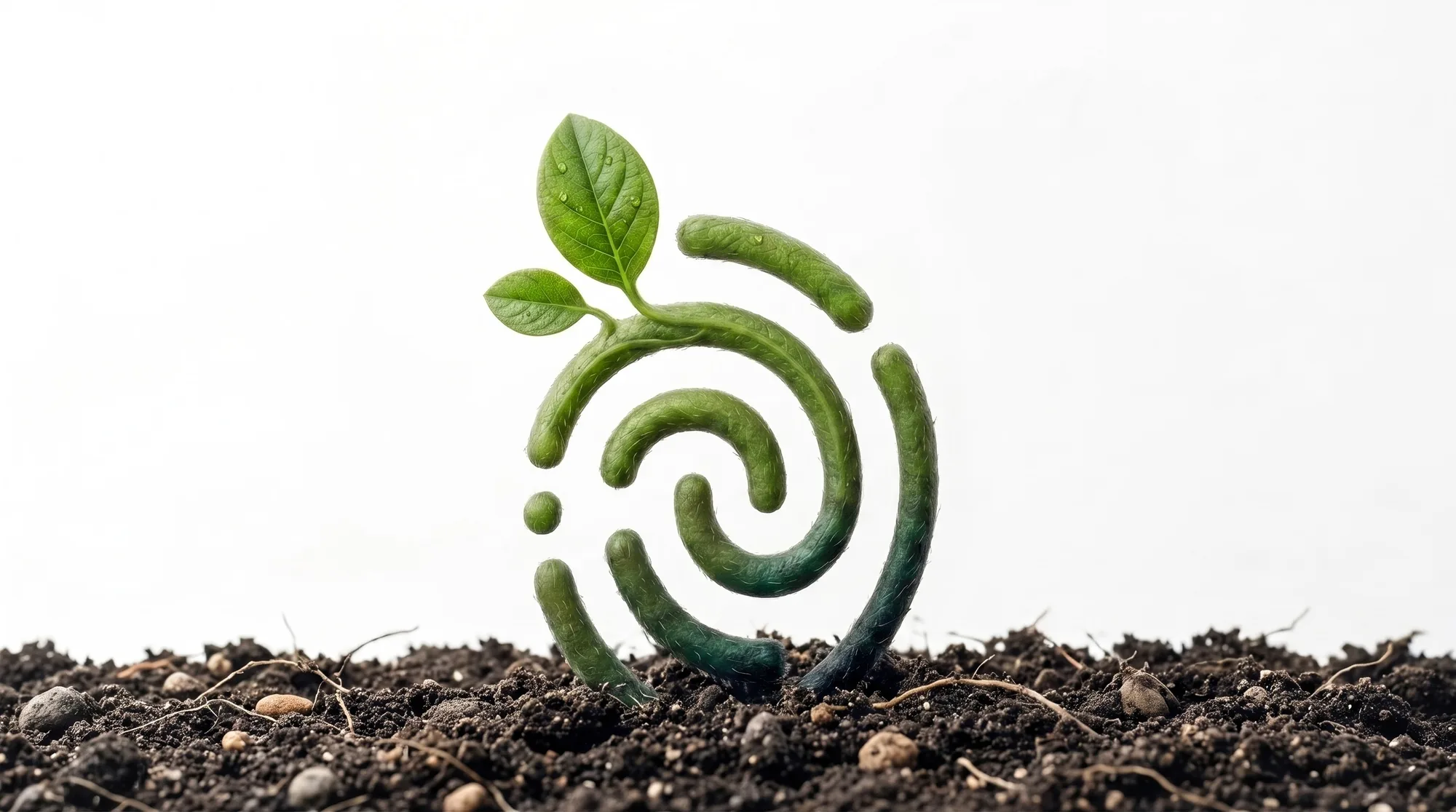
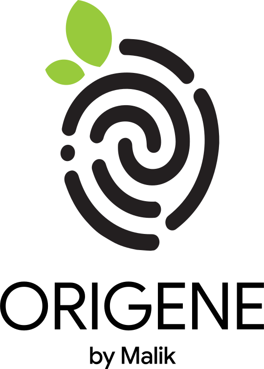
Round 01’s brief — “the fingerprint of farmers” — came back as the whole idea. Hands and sprouts said care; a fingerprint says proof. That is exactly what a traceable brand has to promise.
One mark, six meanings.
A fingerprint is the most personal proof there is — it says this was touched by a real person. Coiled into an O and crowned with a sprouting leaf, it becomes Origene’s promise: every pack traces back to a farmer’s hand.

04 Grow
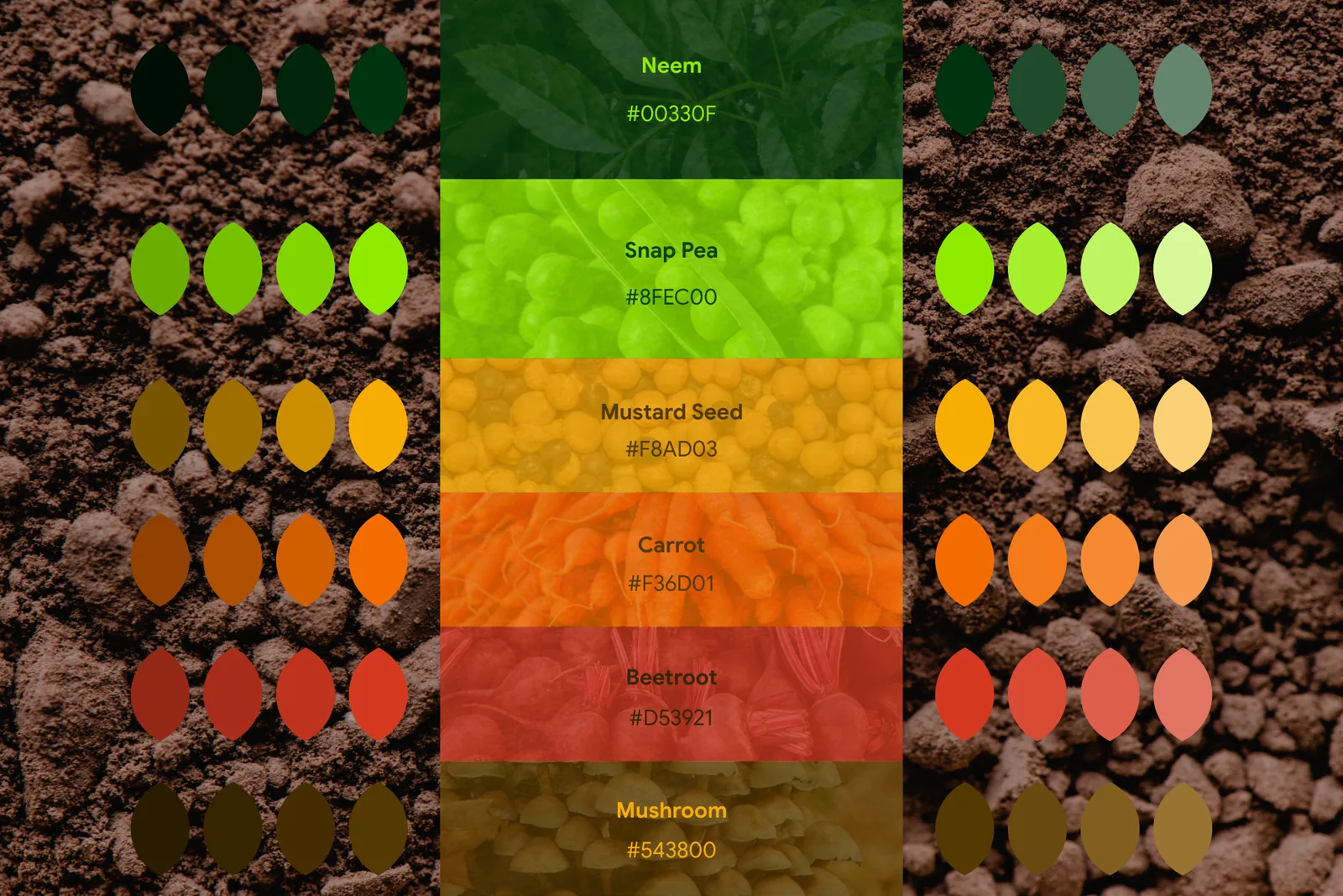
Every colour is a crop.
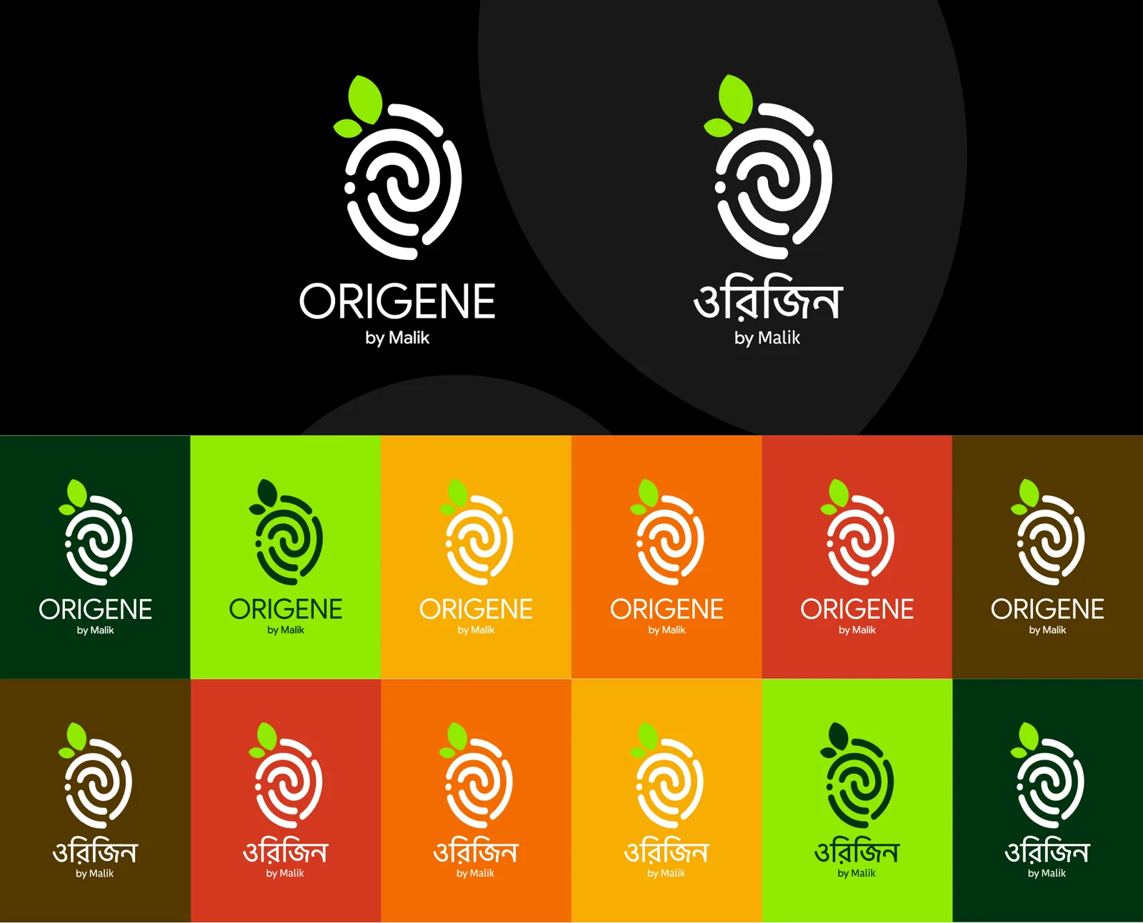
Neem anchors trust. Snap Pea brings freshness. The harvest tones give each product line its own voice without breaking the family. Tap a colour to copy it.
05 Voice
Bilingual by design.
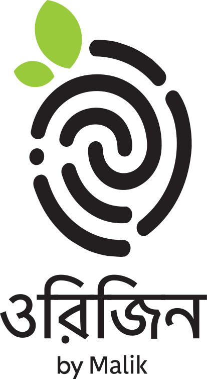
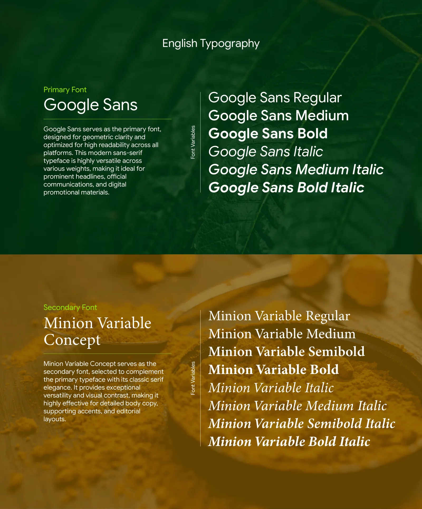
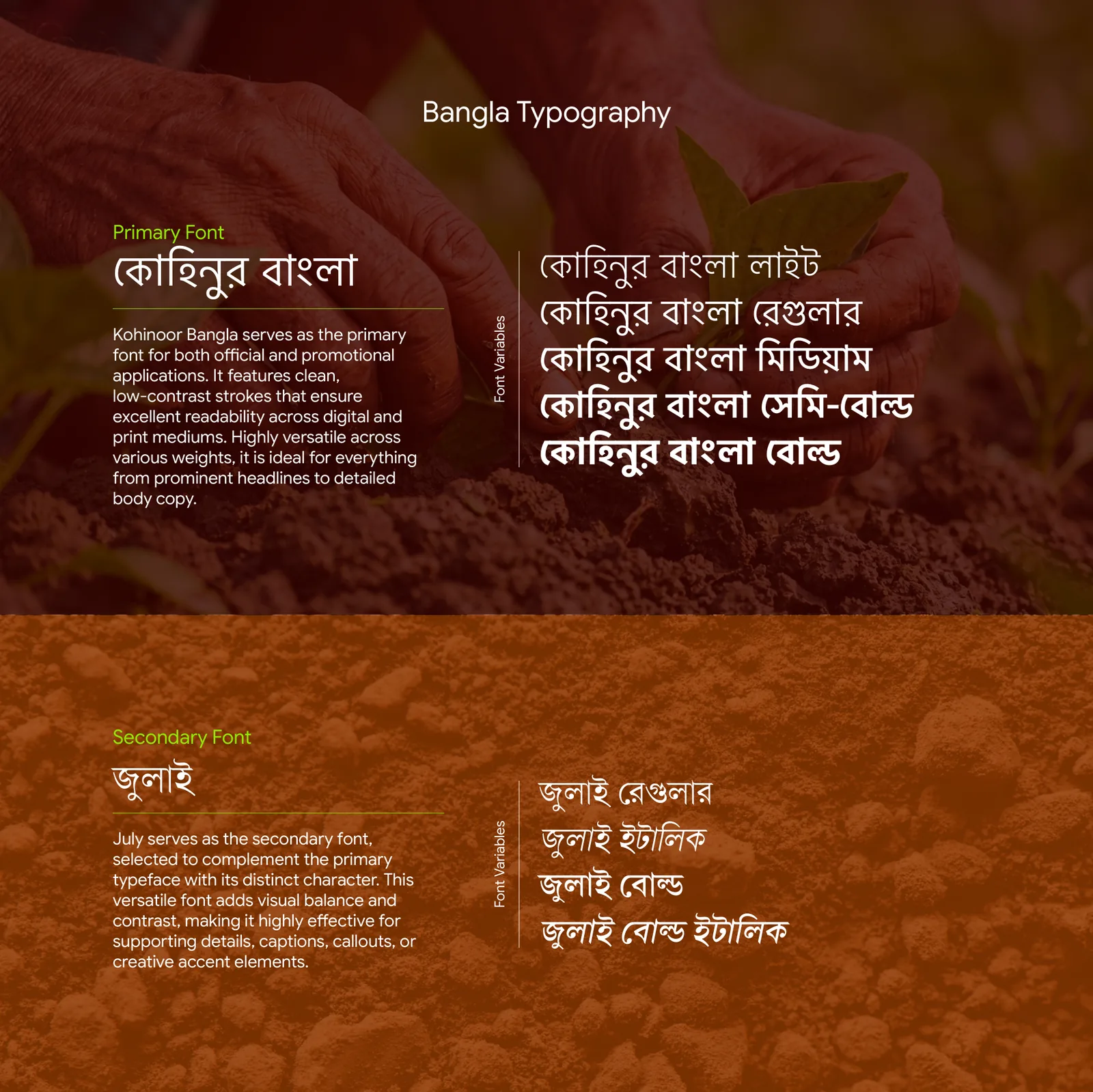
Origene speaks to Dhaka’s urban families in both languages, so the identity was built in both from day one. Neither is a translation of the other — each wordmark is drawn to sit on the same mark with the same weight.
06 Field
The supporting system.
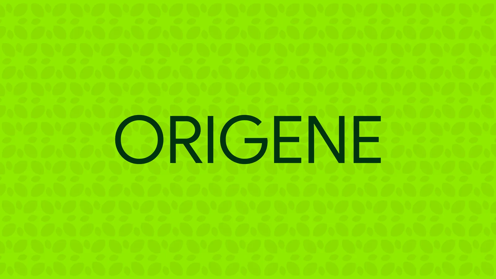
A leaf pattern, a textured wordmark, a crop-and-tool icon family and a photography rule. Small pieces that let the brand fill any surface without shouting its logo.

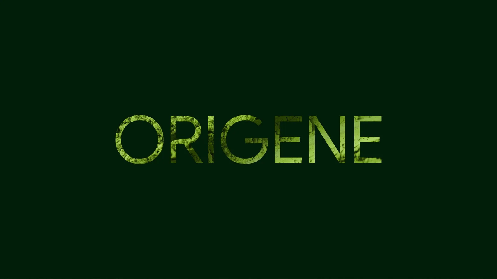
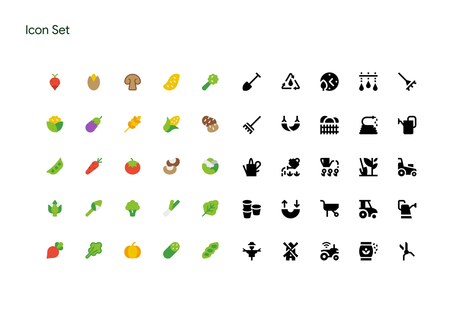
Photography rule
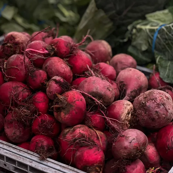
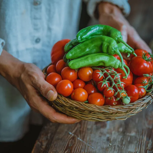
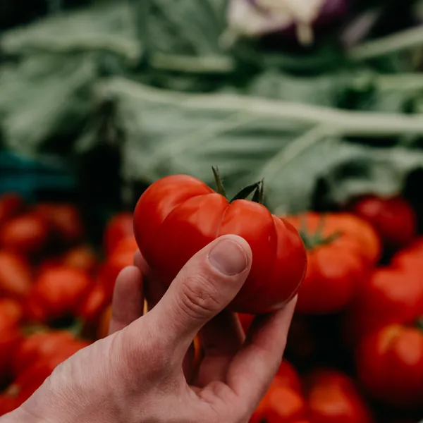
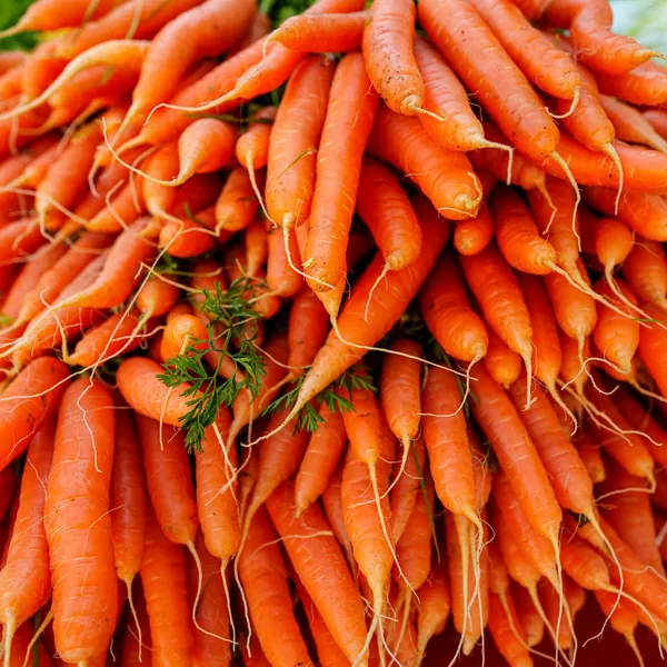
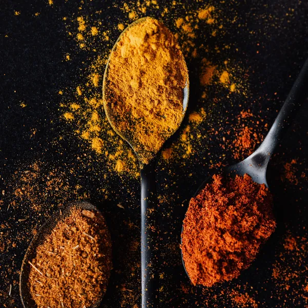
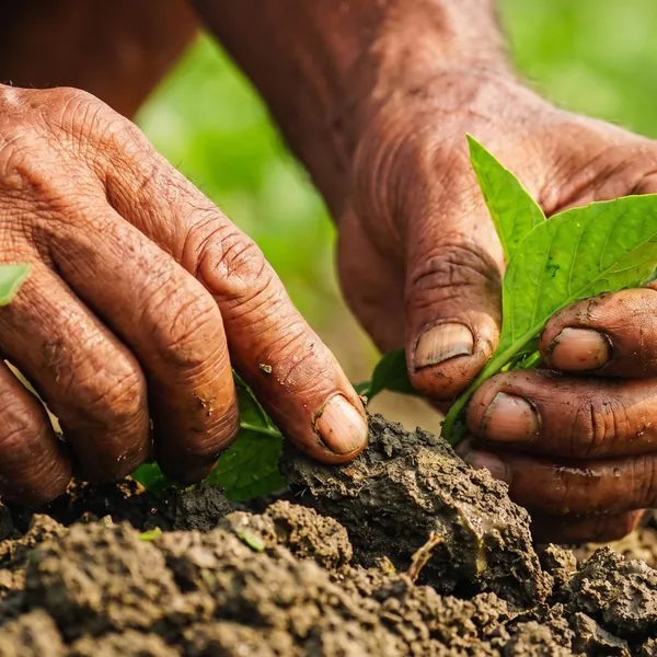
Real farmers. Real kitchens. Natural light.
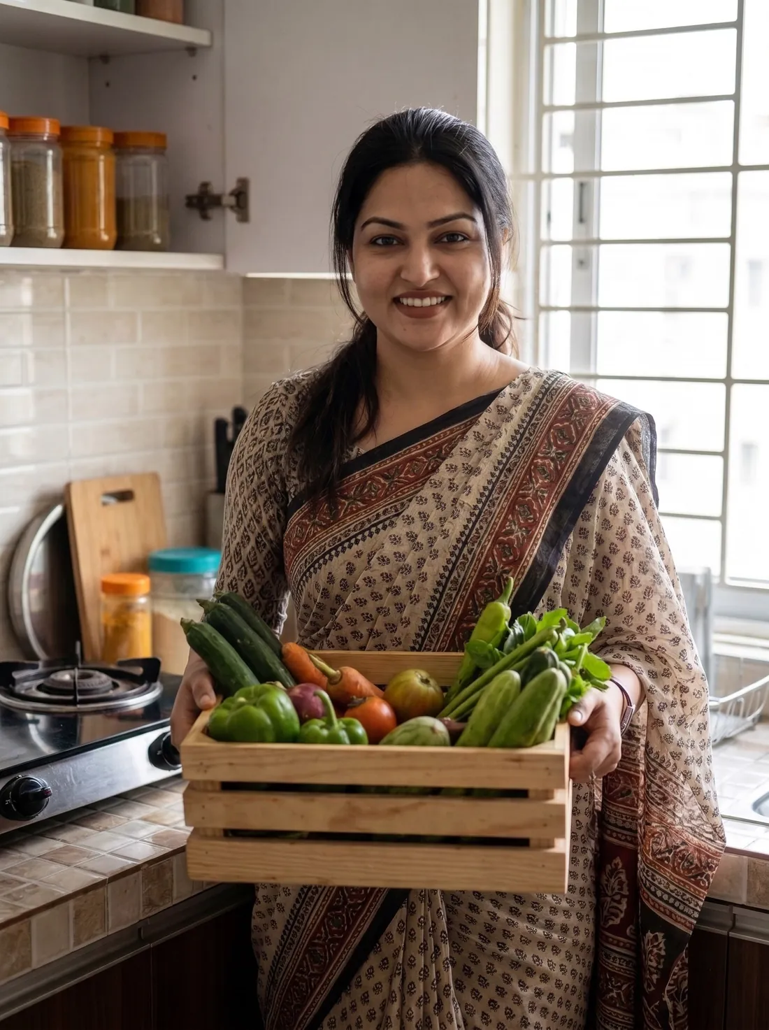
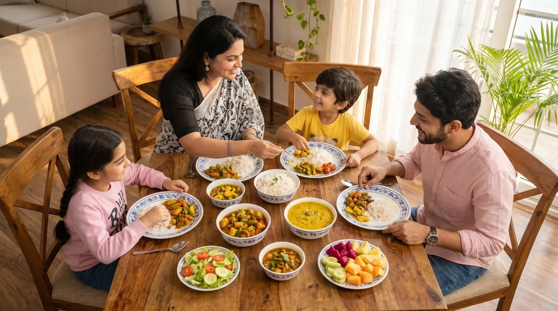
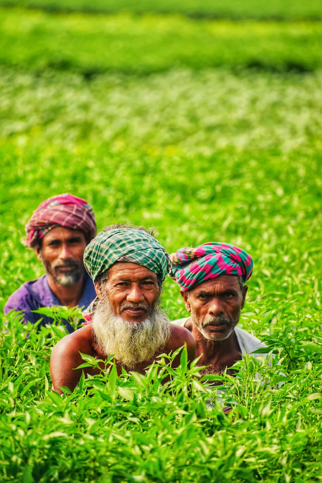
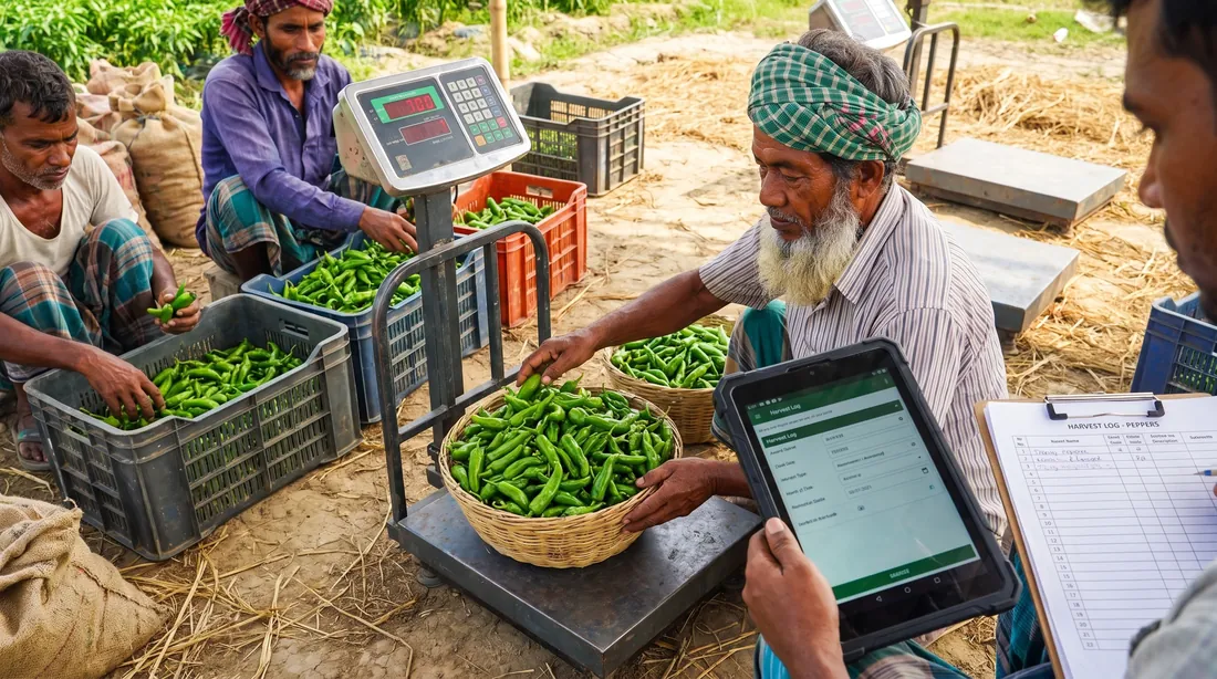
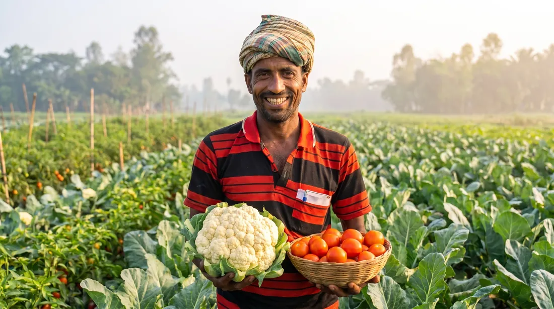
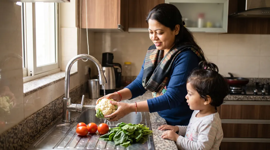
Photo + colour rhythm
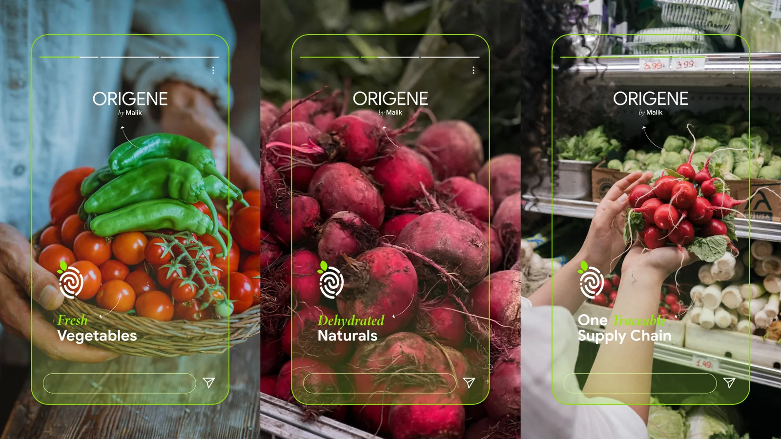
Produce photography alternates with solid crop-colour tiles carrying the mark — a ready-made grid for feeds, menus and shelf talkers.
07 Harvest
The brand in the world.
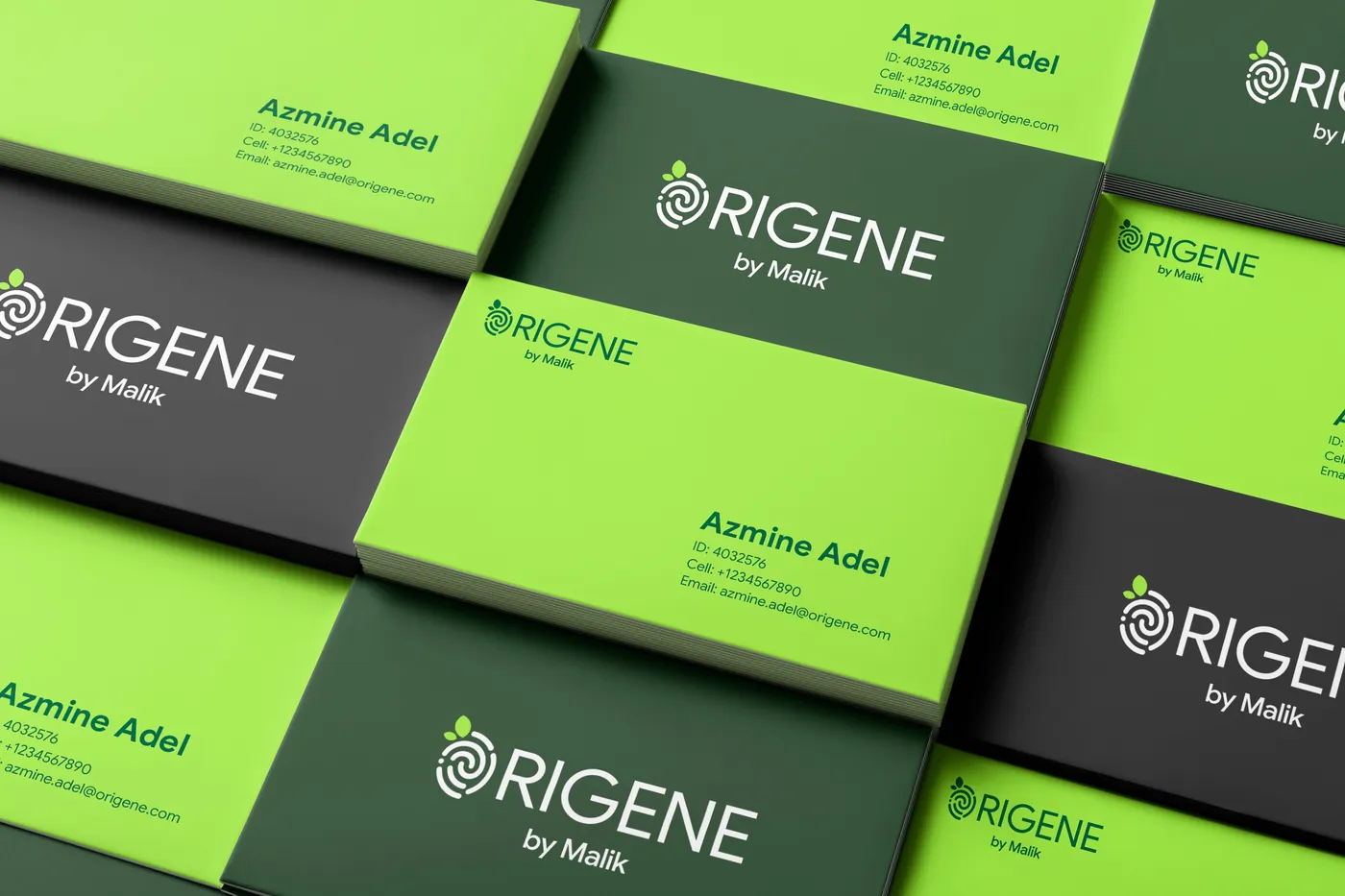
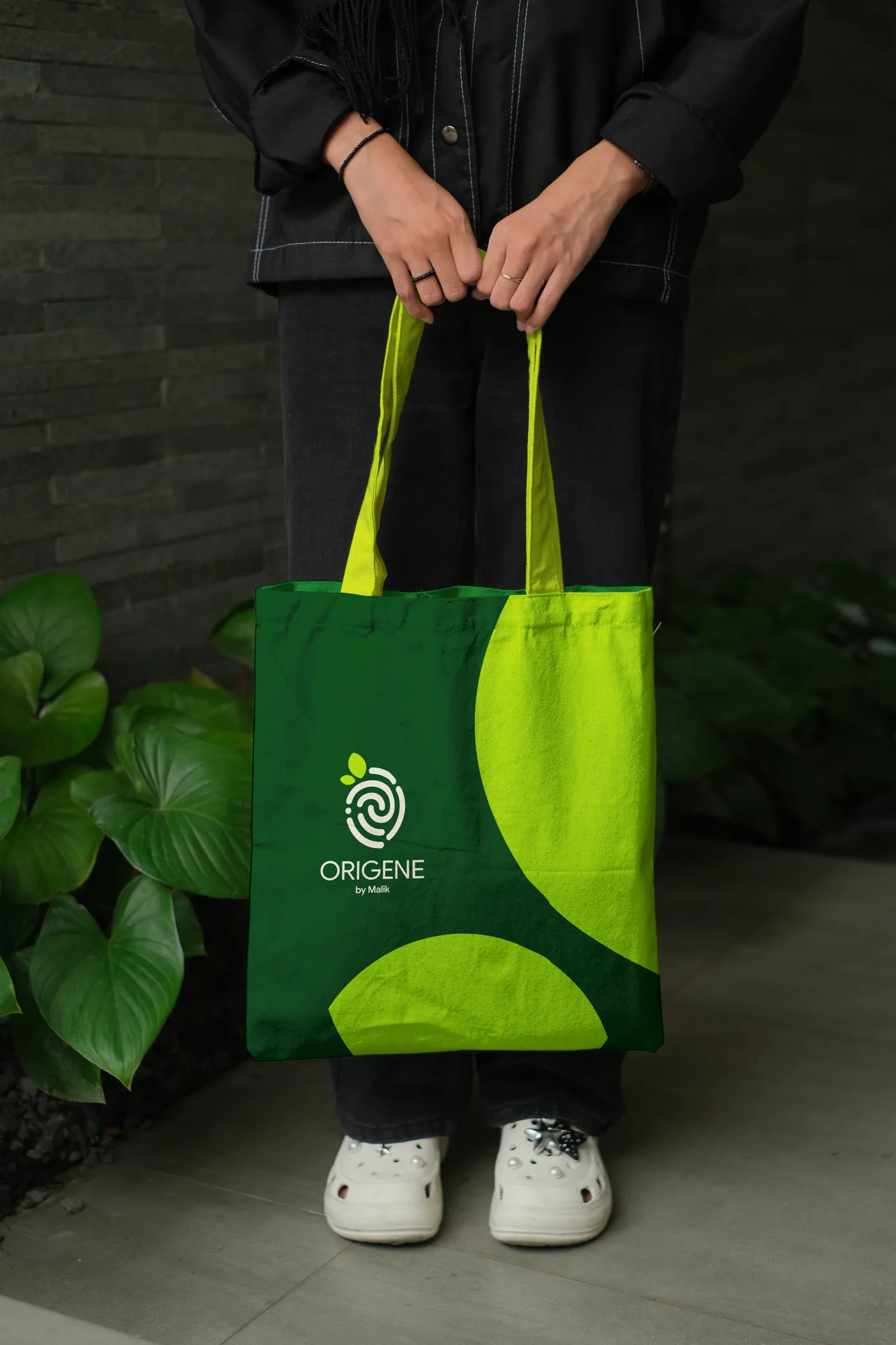
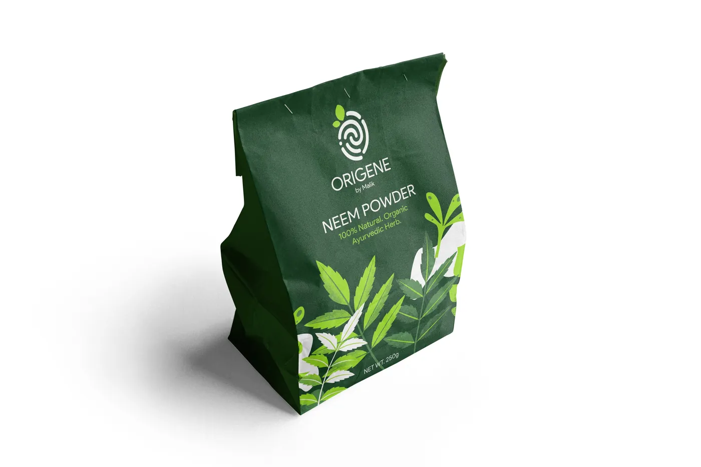
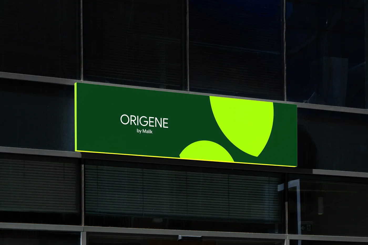
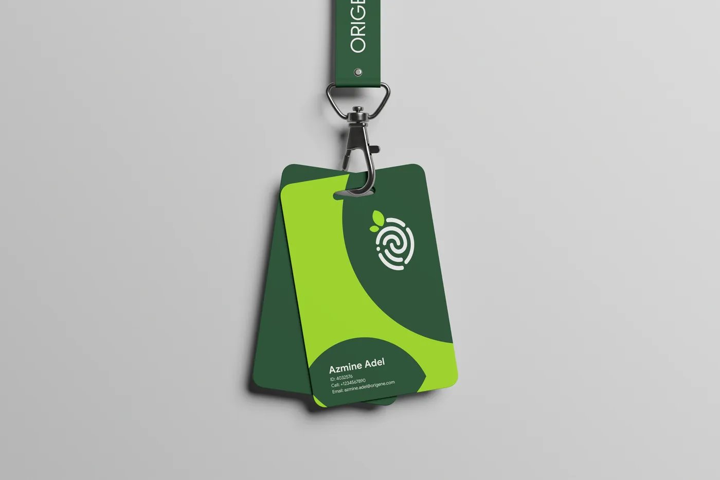
One system, every touchpoint. Each application tests a different part of the identity — and every one is built from the same three ingredients.
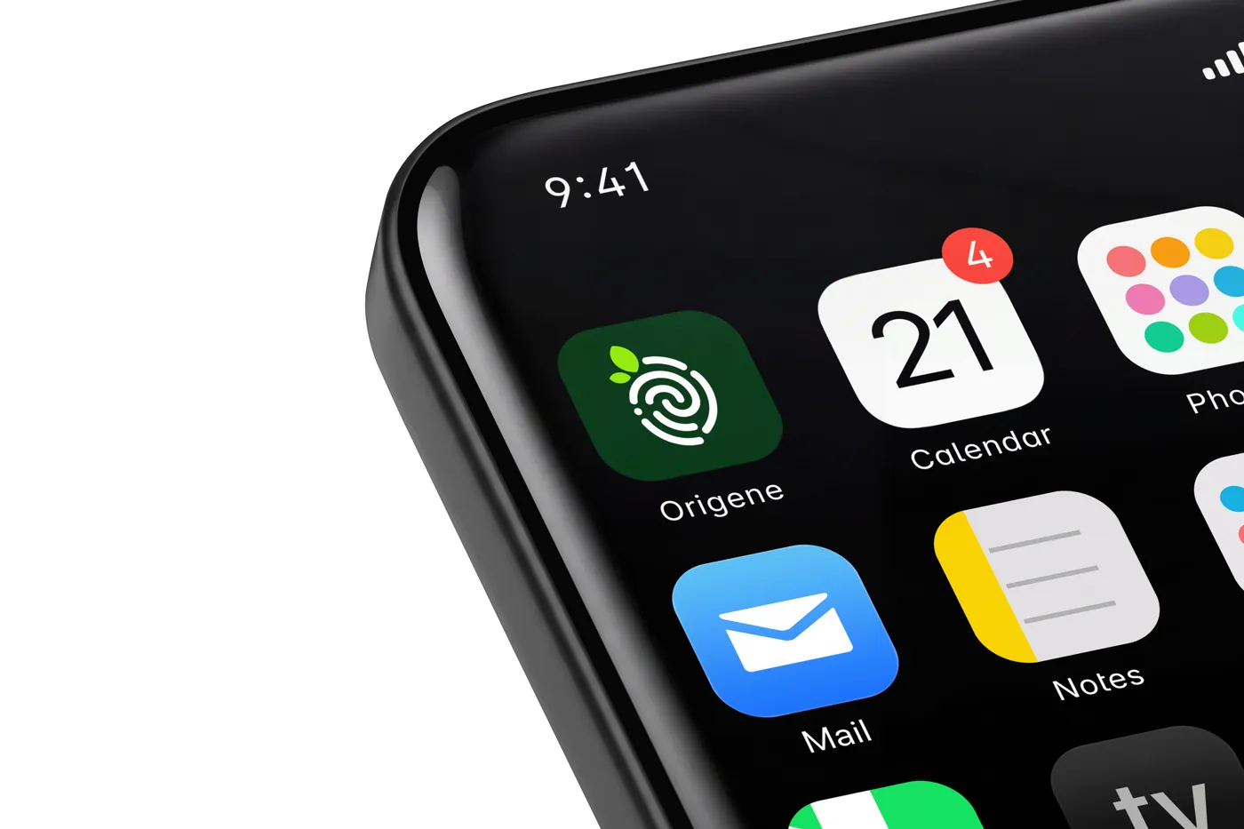
Why it works
Every piece reuses just three things: the fingerprint mark, the leaf shape and the crop palette. That restraint is what makes a brand-new name feel established from day one.
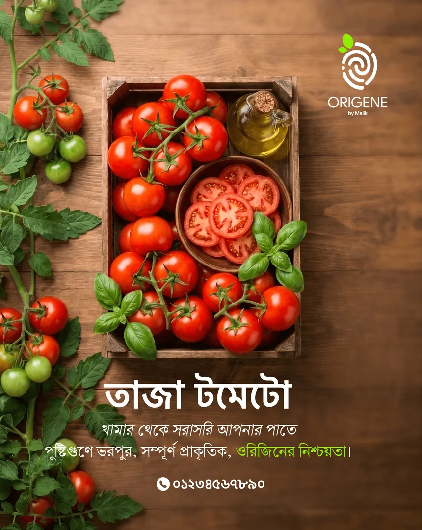
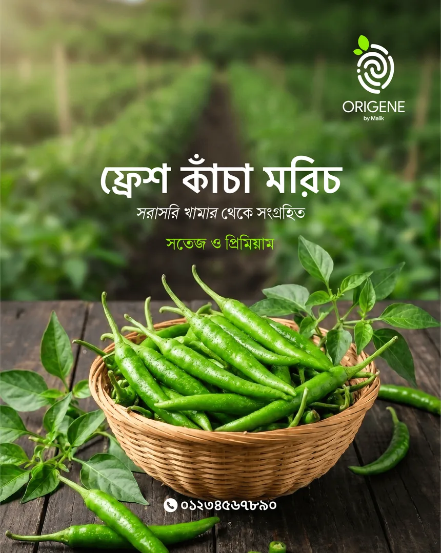
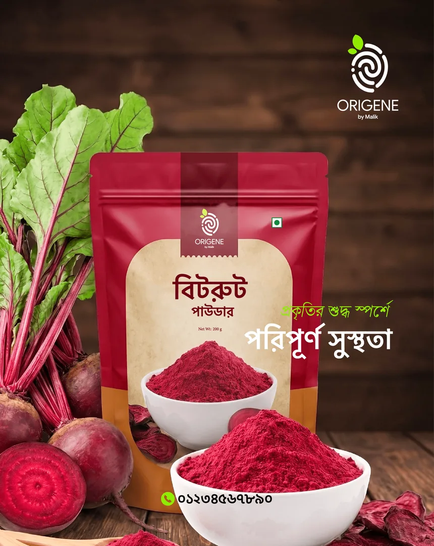
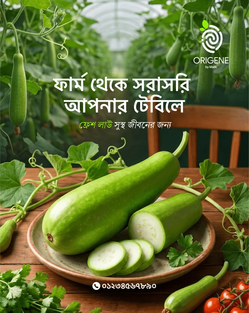
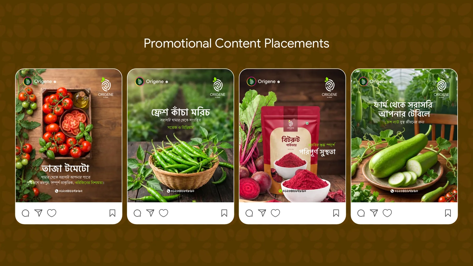
In Bangla, on the feed: promotional posters where the produce is the hero and the mark signs off like a seal of origin.
08 Table
“Safe, nutritious vegetables for families. Dignity for the farmers who grow them.”
— The Origene promise