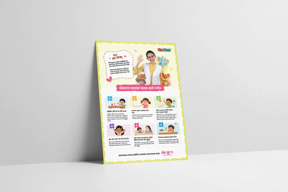
Ms Mun Activity Book Series | Parent Guide Leaflet
Info
Background & Objective
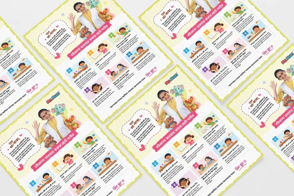
Ms Mun, led by educator and CEO Munzereen Shahid, produces research-backed early childhood development materials. When launching their comprehensive 5-part children's Activity Book set (featuring 600+ activities), they needed a Parent Guide Leaflet to accompany the packaging. The objective was to design an approachable, stress-free instructional flyer that guides parents without making the learning process feel like a rigid academic chore.
Core Visual Concept
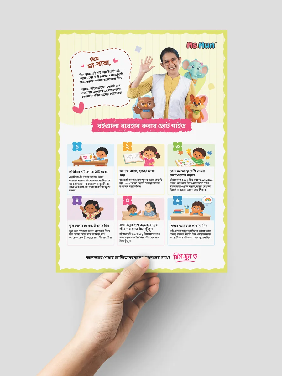
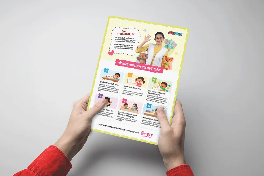
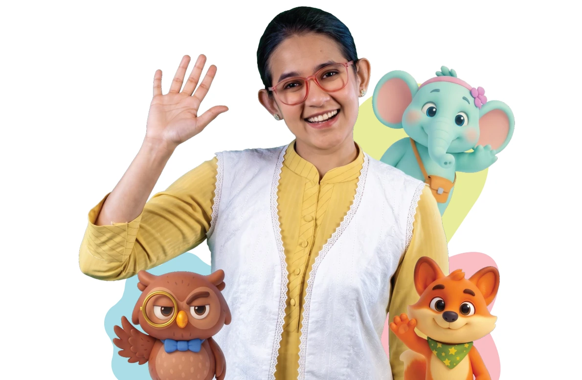
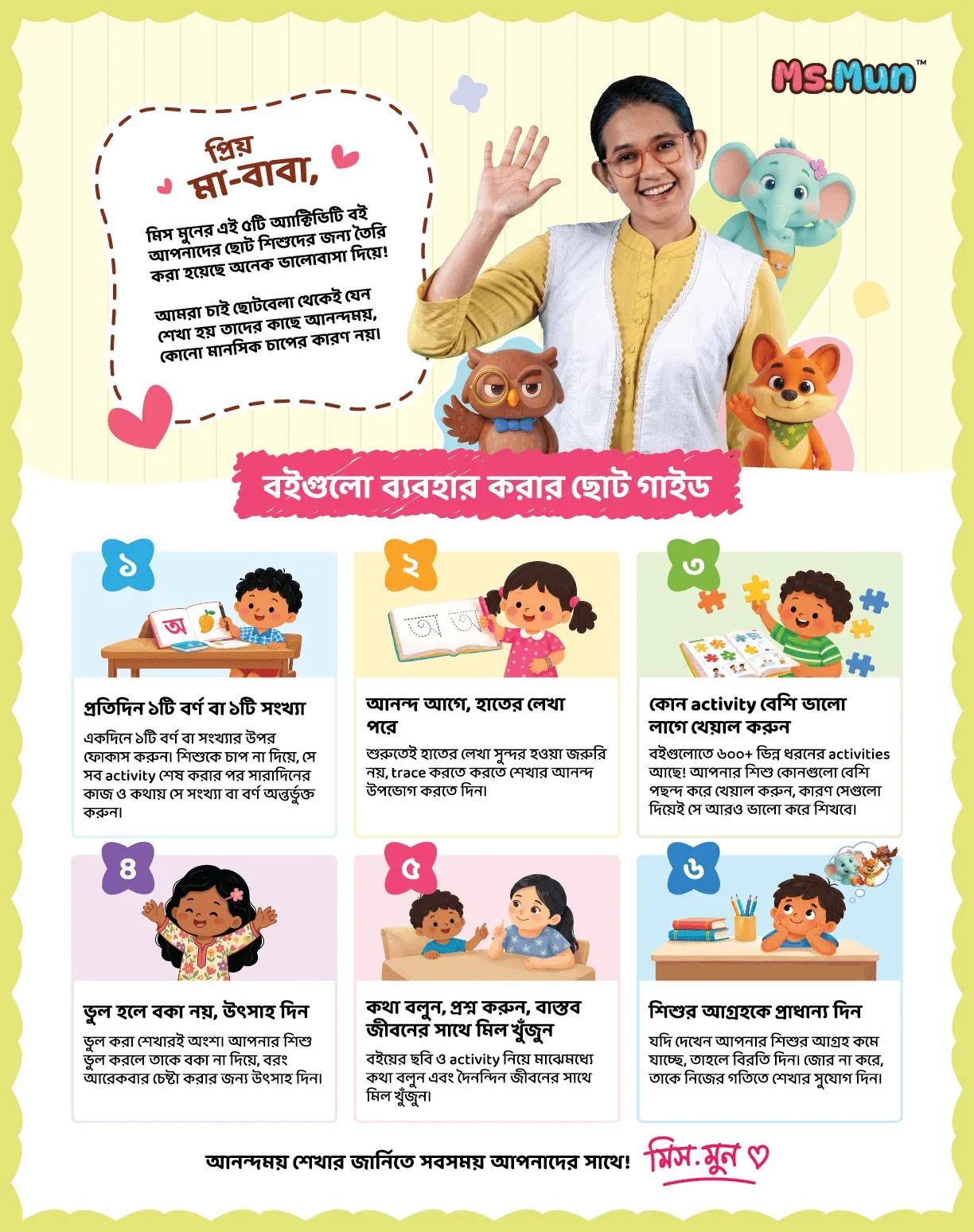
The design pivots entirely on warmth and approachability. The top half features a welcoming portrait of Munzereen alongside the brand's 3D animated mascots (Medha, Maya, and Mishu) to immediately establish trust and familiarity. The bottom half functions as a clean, modular grid, breaking down the pedagogical instructions into six bite-sized, illustrated rules.
Typography & Composition
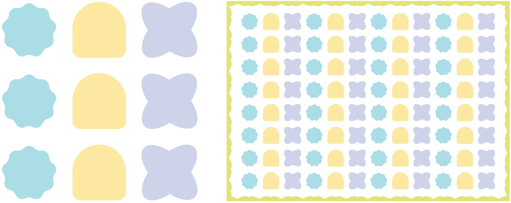
Structured as a clean, two-tier layout for quick scanning. A dashed speech bubble acts as a friendly opening letter to parents, softening the tone before delivering instructions. The strongest, most subtle design decision is the shape integration: the organic, scalloped backgrounds behind the number icons—and the layout's primary border shape itself—are not random. They are pulled directly from the character-specific background patterns on the Ms Mun website, creating a seamless visual ecosystem between print and digital platforms.
Color Palette & Vibe
A soft, playful pastel palette. The background uses a muted, textured cream and pale green to prevent visual fatigue, while the instructional cards use distinct candy-colored headers to separate each rule clearly. The vibrant reds and yellows from the Ms Mun brand identity are reserved specifically for the logo and the welcoming header, maintaining a joyful, kid-friendly aesthetic tailored for young parents.